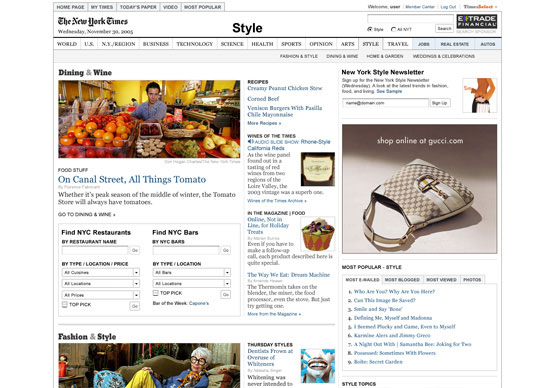
Poznati i uticajni The New York Times redizajnirao je svoje Web izdanje, a Leonard M. Apcar urednik NYTimes.com o ovome kaže sledeće:
Citat
Leonard M. Apcar:We have expanded the page to take advantage of the larger monitors now used by the vast majority of our readers. We’ve improved the navigation throughout the site so that no matter what page you land on, you can easily dig deeper into other sections or use our multimedia.
We also wanted to give our readers a greater voice and sprinkle a little more serendipity around the site by providing prominent links to a list of most e-mailed and blogged articles, most searched for information and popular movies. A new tab at the top of the page takes you directly to all our most popular features.
Another new tab takes you to a list of articles as they appeared in the newspaper, section-by-section.
A svoju opservaciju i ovom redizajnu dao je i Khoi Vinh na svomblogu :
Citat:
I think it’s a sterling piece of work, a great example of how to evolve a user experience rather than reinvent it: the best reaction it could receive from readers (those not among that vanishingly small subset of the general populace who can be called ‘design savvy’) would be something along the lines of “The new design looks just like the old design. — That would suit me fine, because it would signal a continuity that I think is completely appropriate for such a closely watched site like The New York Times’, and besides, I know for a fact that it’s more elegant and more useful than it was before.


Comments are closed.